


Published 2022
branding,graphic,typeface,Naming
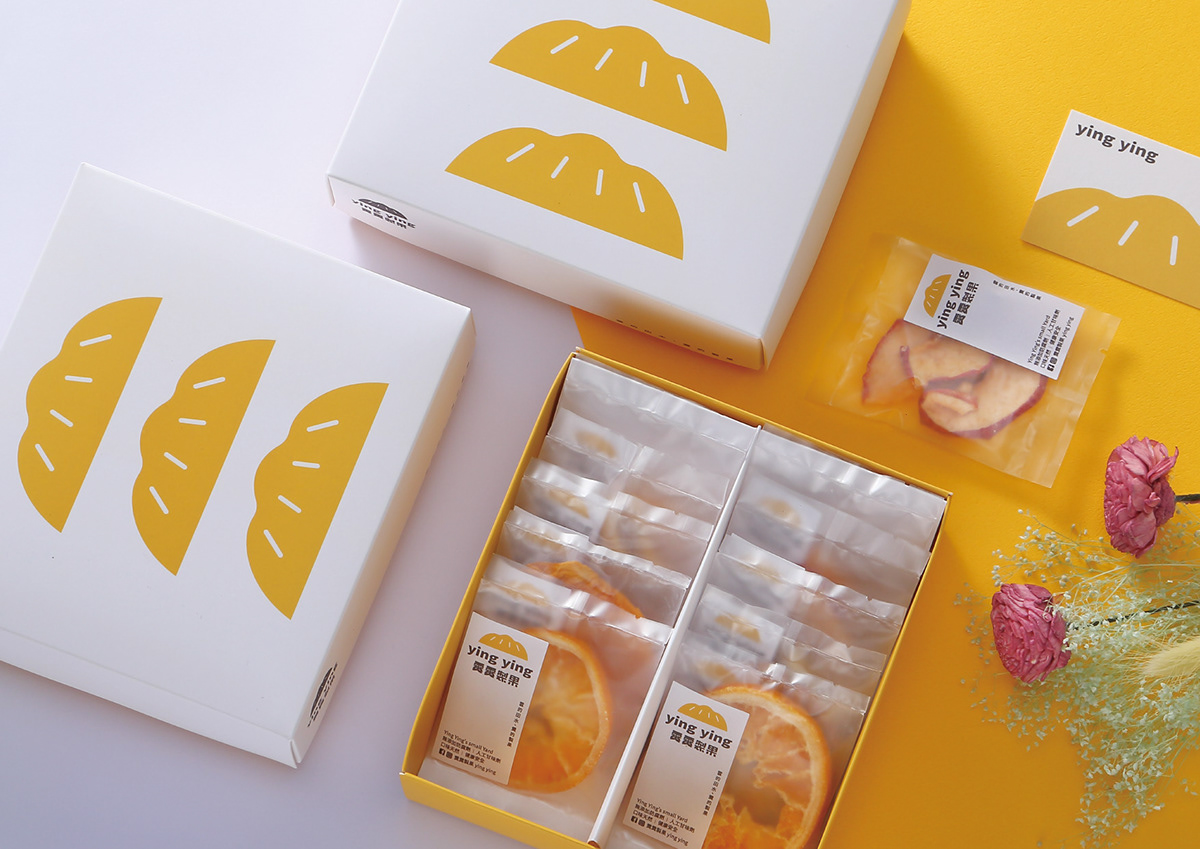
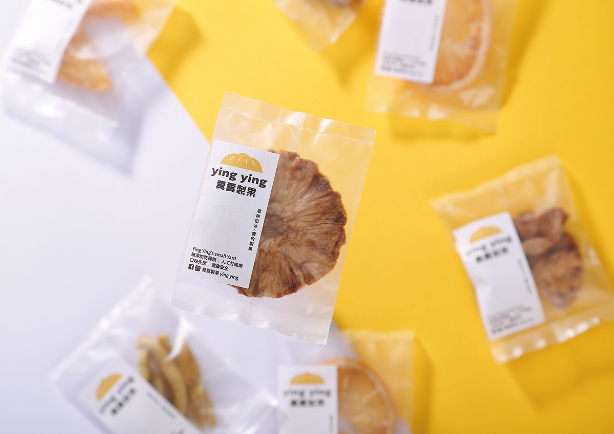
霙霙製果選用台灣在地水果,生產製造的 MIT 優質水果乾,不添加防腐劑,人工甘味劑,口味天然,健康安全,使用電子主控式烘烤設備及專業冷凍冷藏環境,生產中的每一環節都經得起品質考驗,並持續創新編入多樣化產品。
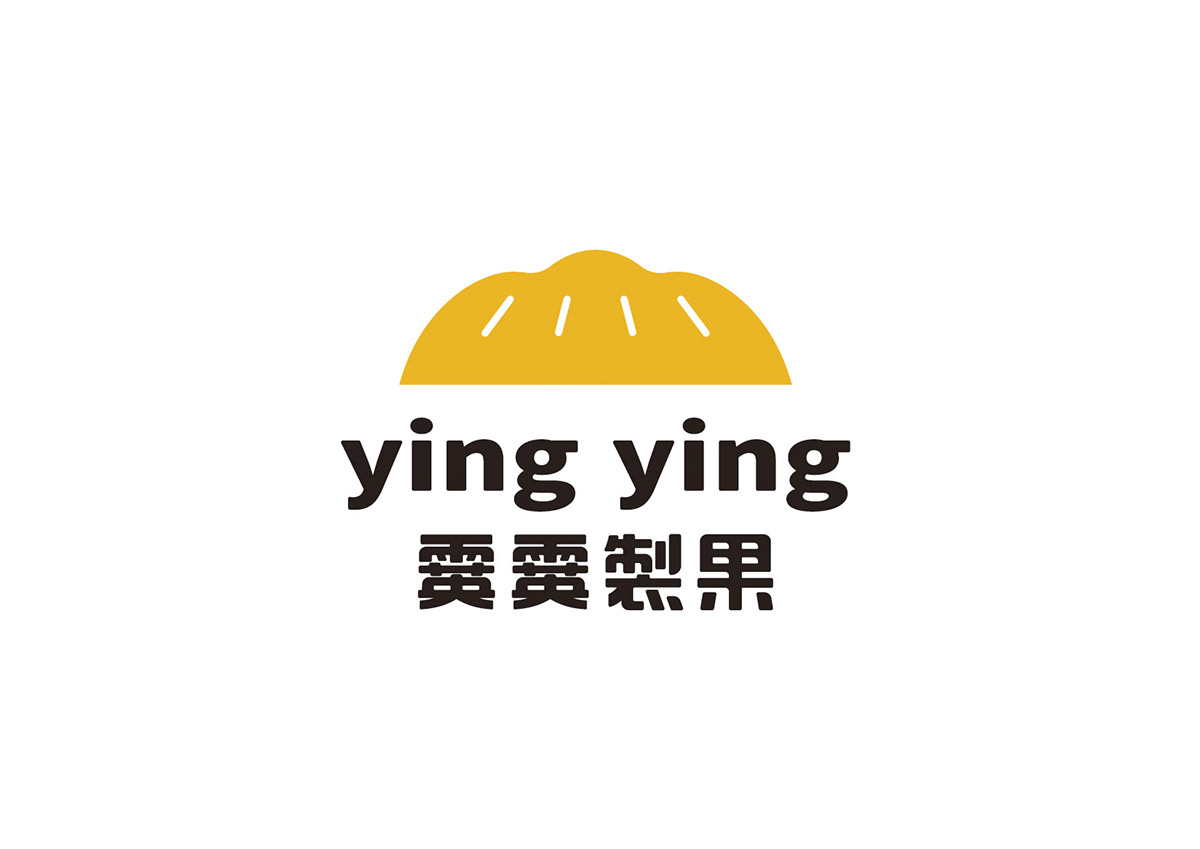
商標以山的形狀結合果乾為設計理念,使用簡單幾何圖形的變化展現孕育水果的山巒,同時也像是切半水果曬乾的意象,黃色讓整體有一種清爽可口氛圍,符合品牌帶給消費者的感覺;搭配具辨識度的標準字,讓整體記憶度更強,成功成為視覺的焦點。
Ying Ying selects local fruits in Taiwan, and produces MIT high-quality dried fruits, without preservatives, artificial sweeteners, natural taste, healthy and safe, using electronic master-controlled baking equipment and professional freezing and refrigerating environment. All production processes can stand the test of quality, and continue to innovate into diversified products.
The logo is designed with the shape of a mountain combined with dried fruit. Using simple geometric figures are used to show the mountains where the fruit is born, at the same time, it also resembles the image of half-cut fruit and dried. The yellow color gives the whole a refreshing and delicious atmosphere, which is in line with the brand to bring consumers the feeling; with recognizable standard words, the overall memory is stronger, and it successfully becomes the focus of vision.
Designer 鄭啟宏
Photography 周政毅


